AI promises to make people more productive, but it’s often hard to tell whether those gains are real. ROI calculations were designed for industrial machines, not for AI assistants that quietly reduce busywork in the background. Nebuly’s latest feature tackles that blind spot. It reveals, in concrete numbers, how much time your AI saves compared with manual work.
Why time saved is the foundation of ROI
Time is money. When support agents resolve tickets faster, or an internal copilot retrieves information in seconds instead of minutes, those hours saved translate directly into cost reductions.
Our framework for measuring business value from Gen AI products emphasises that the first step to quantifying return is to convert time saved into cost savings. In customer support, for example, agent productivity gains come from multiplying the time saved per ticket by the number of tickets. Similarly, for internal copilots the key metrics include hours saved when employees retrieve information more quickly and fewer escalations and errors. Comparing these figures against a baseline helps you turn abstract AI benefits into concrete ROI.
See your ROI in action
Nebuly’s new hours‑saved metric lives inside the Reports section of the Nebuly playground, so anyone can explore it without signing up. Here’s how it works:
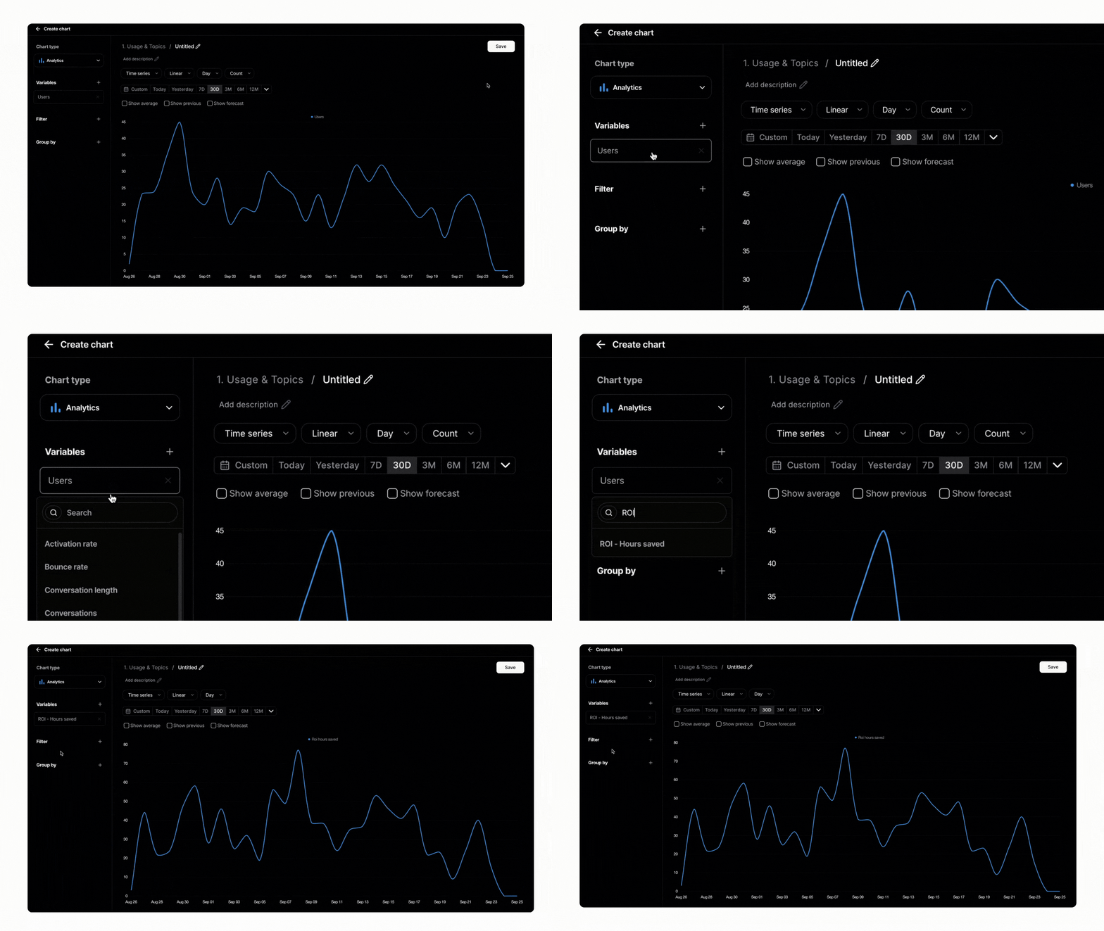
1. In the Nebuly playground, go to Reports and click Add new chart. Choose the analytics chart type. The chart builder defaults to Analytics, which is perfect for trend lines and comparisons.
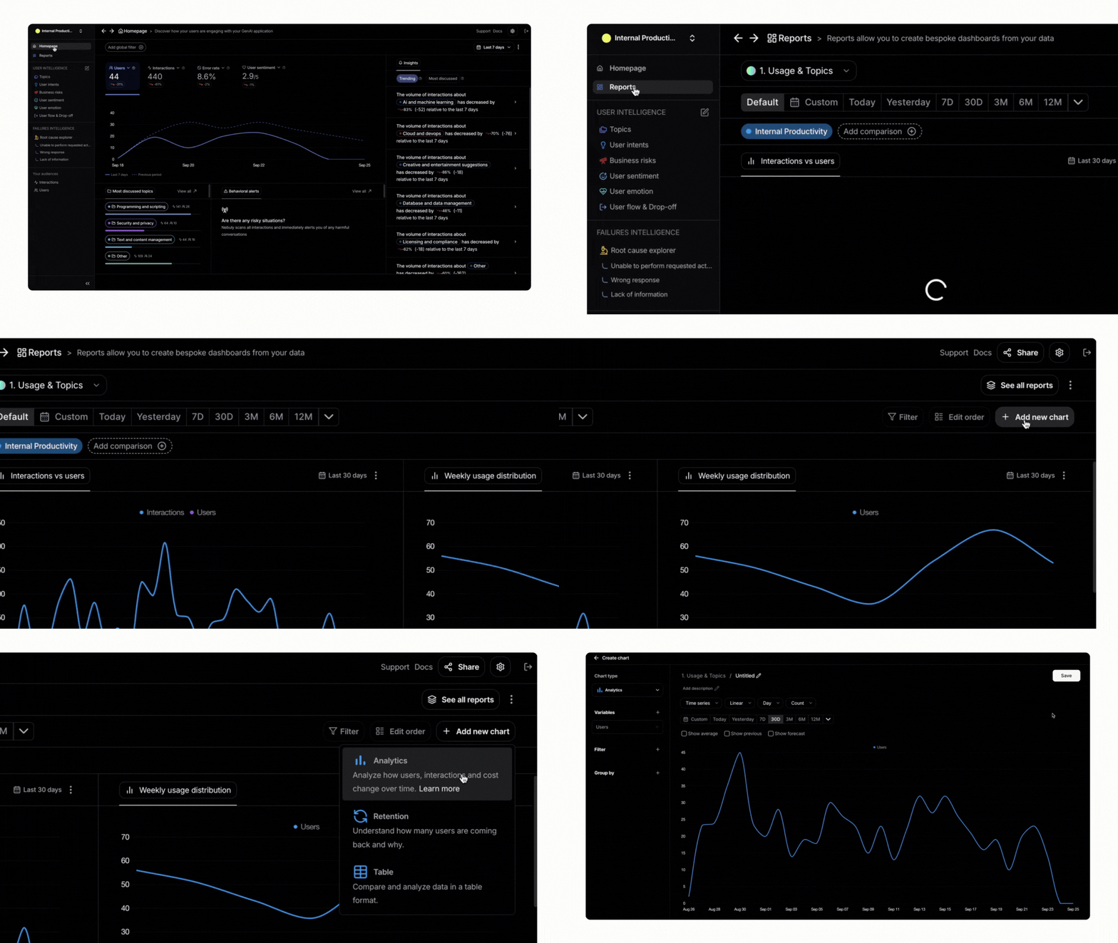
2. Under Variables, search for “ROI” and pick ROI – Hours saved. Nebuly will overlay this metric on a line chart (alongside other variables like interactions).
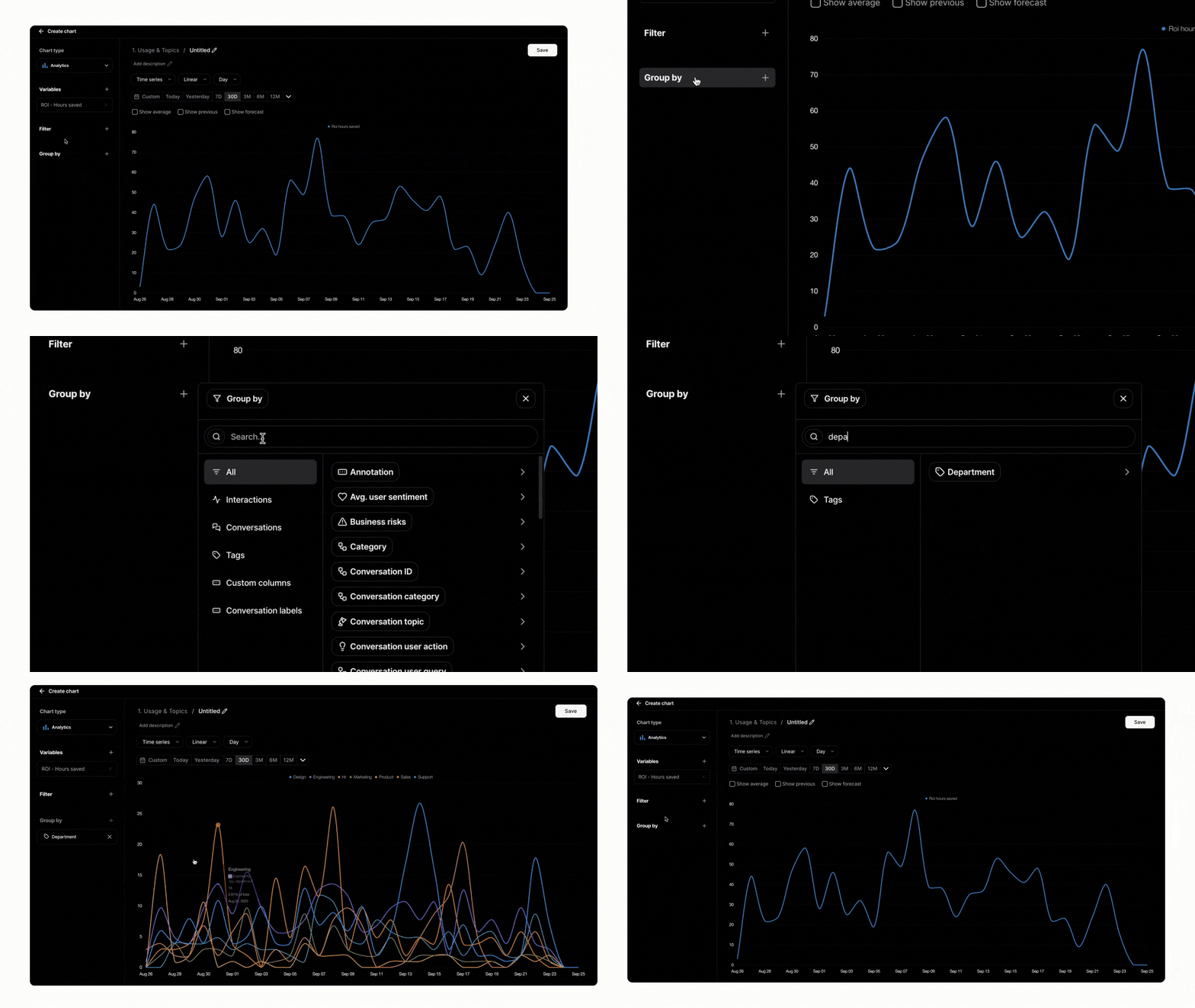
3. Use the Group by or Filter options to segment the data. You might break down hours saved by department, geography (via tags), user segments or any custom field. This lets you see which teams benefit most from AI.
4. Pick the best visualization. Switch between line, bar or pie charts to highlight trends or distribution. A bar chart comparing hours saved across departments can be more telling than a line chart.
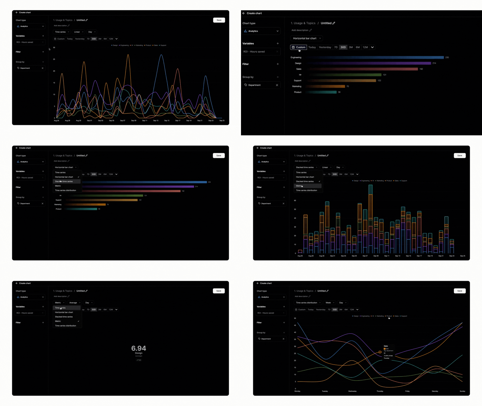
At the end of this process you’ll have a clear visualisation of how many hours AI is saving compared with the manual baseline.
.png)
Privacy‑first and straight to the point
Nebuly built this feature with a privacy‑first mindset. The hours‑saved metric is derived from aggregated interaction data; no sensitive user information is exposed. The goal is to provide honest answers without the need for invasive data collection. This means teams of any size can confidently measure AI impact without compromising customer or employee trust.
Turning numbers into impact
Seeing the time saved is only the beginning. To make the business case for AI:
- Convert hours saved into cost savings. Multiply the number of hours saved by the average hourly cost for the task. This simple calculation will put a dollar figure on your AI assistant’s contribution.
- Compare against your baseline. Use the hours‑saved chart to contrast current performance with historical data. Nebuly recommends comparing financial metrics like hours saved and escalation rates against pre‑deployment baselines to prove improvement.
- Combine with other signals. Hours saved is one part of the story. Look at success rates, error rates and user sentiment to understand where the assistant can improve or where additional training is needed.
Explore it yourself
Nebuly’s hours‑saved metric makes ROI tangible. With just a few clicks you can see how AI shortens workflows, frees up staff time and delivers concrete value.
Head to the Nebuly playground and build your own report. And if you’d like to explore it in your specific use case, book a demo with us. If you’d like to go deeper into your specific use case, book a demo with our team. Whether you’re a product manager validating an internal copilot or a support leader tracking ticket deflection, this feature replaces intuition with hard data. Try it out and see exactly where AI is saving the most time.


